 Image: Davidson-Pilon, Cameron (2015). “Percentile and Quantile Estimation of Big Data: The t-Digest.” DataOrigami.
Percentiles Don’t Add Up
An on-call engineer was paged on a Saturday. Users were reporting three-second load times. The engineer checked the dashboard. p99 latency: 180ms. Stable for weeks.
But the 180ms was meaningless. Six replicas were each computing a local p99 and shipping it to the monitoring system. The system averaged them, which produced a number, not a percentile. One replica was saturated while the others were fine. The saturated replica disappeared into the average. The fleet’s actual p99 was 2.8 seconds.
Why Exact Percentiles Don’t Scale
A percentile is a statement about rank. The 99th percentile of a set of latencies is the value below which 99% of requests fall. Computing it requires sorting the full set, which means keeping every data point.
At scale, this is impractical. A service handling ten thousand requests per second accumulates 864 million latency values per day. Storing and sorting that dataset to answer “what was the p99 in the last five minutes?” isn’t feasible in production.
Monitoring systems solve this with sketches. A sketch compresses a large dataset into a compact structure that answers statistical queries with a predictable error ceiling, using a fraction of the memory that exact computation would require. The ceiling is configured when you create the sketch. More memory buys tighter accuracy.
What t-Digest Does
Ted Dunning and Otmar Ertl introduced t-digest as a sketch optimized for quantile estimation[1]. The key property is that its accuracy is highest at the tails and lowest near the median.
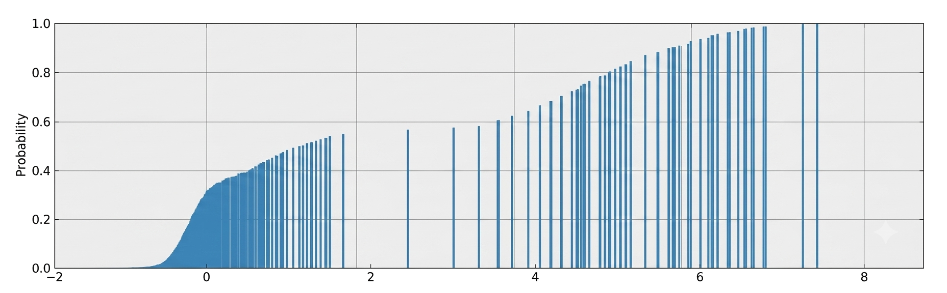
t-digest processes observations one at a time without holding the raw data. Each observation is absorbed into the nearest eligible centroid or starts a new one, then discarded. The only persistent structure is a list of centroids. Each stores a mean value and a weight representing the number of observations it covers.
The compression is dramatic. A thousand latency measurements compress into dozens of centroids. Cameron Davidson-Pilon fed eight megabytes of Pareto-distributed data into a t-digest and measured the output at five kilobytes, with an error rate below 0.002%[2].
Centroids near the tails are small and numerous, each representing few data points. Centroids near the median are large and few, each covering many values[1].
This asymmetry matches how you use latency metrics. In large distributed systems, the slowest requests determine what users experience, not the average. Jeff Dean and Luiz André Barroso made that case in 2013, and the industry shifted toward percentile-based SLOs as a result[3].
A compression parameter δ is configured when creating a t-digest instance. It sets a limit on how many centroids the sketch is allowed to maintain[1]. Raising δ improves accuracy at the cost of size.
Separately computed t-digests merge without loss of accuracy[1]. Merging works by combining the centroid lists and re-compressing. The result is equivalent to having processed all observations in a single pass. Each replica computes and ships a t-digest instead of a finished p99. The monitoring system merges them. The 2.8-second tail doesn’t disappear into an average.
Netflix hit this problem. Storing raw latency observations at their scale was too expensive. t-digest let them summarize per instance and merge at query time, keeping memory flat as traffic grew[4].
Histograms vs. Summaries in Prometheus
Prometheus faces the same aggregation problem, and its two instrumentation approaches handle it differently[5]. Histograms aggregate bucket counts across replicas, the way t-digest merges centroids. Summaries reproduce the opening mistake.
Summaries compute quantiles inside the application process. Each replica computes its own p99 from local observations and exports the result as a single number. The raw observations are discarded, leaving the monitoring system nothing to combine with other replicas. Averaging those numbers is mathematically invalid, but the metric format makes it look valid. The documentation says summaries are “not aggregatable,” but this warning is often ignored.
Histograms record observations in predefined buckets and ship the raw bucket counts. The monitoring system computes quantiles from the bucket data at query time. Because bucket counts are additive, you can aggregate across replicas first and compute percentiles from the combined data. Histogram quantiles are accurate to within the width of the relevant bucket[5].
Native histograms, the newer Prometheus feature, use adaptive bucket boundaries instead of fixed ones. You get accurate quantile estimates without deciding on boundaries upfront.
How Teams Get This Wrong
Trusting pre-aggregated exports. Many APM tools receive metrics as precomputed percentile values from the source. A p99 arriving at the monitoring system as a single number can’t be recomputed, decomposed by attribute, or combined with other data. The accuracy is invisible and the provenance is opaque.
Averaging percentile metrics. If three replicas report p99 values of 100ms, 150ms, and 1200ms, the fleet p99 is not their average. It depends on request distribution across those replicas. The average of percentiles tells you nothing useful about the tail.
The Prometheus summary trap. Prometheus summaries expose a quantile label that looks like histogram data, but each value is a finished percentile from a single replica. The format looks aggregatable. It isn’t.
Setting bucket boundaries without looking at the data. Classic histograms require bucket definitions before any requests arrive. Boundaries at 0-100ms and 100-500ms look reasonable until your service develops a bimodal distribution with peaks at 20ms and 450ms. The p99 estimate becomes imprecise at the boundary that cuts through the slow population.
Put It Into Practice
When reading a percentile metric in a dashboard or alert, ask where the computation happened. A p99 computed at query time from raw observations is different from a p99 computed client-side and exported as a finished number.
When you see an aggregate percentile across replicas, verify the aggregation was done correctly. histogram_quantile(0.99, sum(rate(...))) is correct. avg(metric{quantile="0.99"}) is not.
t-digest is the widely deployed answer to query-time quantile computation, with native implementations in ClickHouse, Redis, and Elasticsearch. Where you have the choice, use t-digest.
What This Doesn’t Cover
DDSketch. t-digest’s error guarantee is rank-based. Accuracy is highest at the tails and degrades toward the median. DDSketch offers a relative-error guarantee instead, where error is proportional to the quantile value itself[6]. Datadog uses it in production.
The scaling function. t-digest’s tail accuracy comes from a scaling function that controls how centroid sizes grow toward the median. The Dunning and Ertl paper works through several variants, including a newer hybrid digest with tighter guarantees[1]. Worth reading if you’re implementing or tuning one directly.
References
- Dunning, Ted and Otmar Ertl (2019). "Computing Extremely Accurate Quantiles Using t-Digests." arXiv:1902.04023. https://arxiv.org/abs/1902.04023
- Davidson-Pilon, Cameron (2015). "Percentile and Quantile Estimation of Big Data: The t-Digest." DataOrigami. https://web.archive.org/web/20230319061101/https://dataorigami.net/2015/03/19/Percentile-and-Quantile-Estimation-of-Big-Data-The-t-Digest.html
- Dean, Jeff and Luiz André Barroso (2013). "The Tail at Scale." Communications of the ACM, 56(2): 74-80. https://research.google/pubs/pub40801/
- Ortiz, Thiara (2023). "Measuring Real-Life Latency of the Internet: A Netflix Story." SREcon23 Americas. USENIX. https://www.youtube.com/watch?v=wXWFrKiJXHE
- Prometheus (2024). "Histograms and Summaries." Prometheus Documentation. https://prometheus.io/docs/practices/histograms/
- Masson, Charles, Jee E. Rim, and Homin K. Lee (2019). "DDSketch: A Fast and Fully-Mergeable Quantile Sketch with Relative-Error Guarantees." VLDB 2019. https://arxiv.org/abs/1908.10693
Outtakes
The sketch family. t-digest belongs to a family of probabilistic data structures called sketches. HyperLogLog estimates cardinality. Count-min sketch estimates frequency. Bloom filters test set membership. Each trades exactness for a fixed memory budget. t-digest does the same for rank statistics (Cormode and Muthukrishnan, 2005).
The average of averages. If Group A (10 people, $50K average) and Group B (100 people, $100K average) merge, the combined average is $95.4K, not $75K. Averaging the group averages loses the size information. Percentiles fail for the same reason.
The exponential histogram alternative. OpenTelemetry’s exponential histograms use a similar principle through a different mechanism: bucket boundaries scale geometrically, concentrating precision at the tails without upfront configuration. Both solve the same problem from different directions (OpenTelemetry, 2024).
Changelog
2026-06-21 Initial draft.